2023
Cross Country Healthcare
Product Design, UX Copy Writing
Sr. Product Designer

Intellishift was developed in response to the increased need for per diem staffing that resulted from the COVID pandemic. More than ever, healthcare professionals needed a quick and easy to use mobile solution to pick up shifts across facilities and units as they're made available and as their schedule permits.
Healthcare Professionals needed a modern, mobile friendly scheduling tool to access per diem shifts easily and accessibly. There were some solutions on the market, but they were dated, under featured, and riddled with poor UX. Intellishift aimed to address the many issues these healthcare professionals experienced:
Processes: Booking, accepting offered shifts, messaging, profile and preference customization, and navigating information and opportunities within their facilities.
Pain points:
User: Miscommunications, shift cancelations, incomplete information, lack of personalization.
Client: Staff satisfaction, staff performance and engagement, compliance and accreditation, consistent patient care/positive outcomes, staffing transparency, onboarding efficiency, operational efficiency, financial performance, technological utilization.
The Opportunity:
- Capitalize on a market opportunity with weak competition.
- Build a scalable, customizable, white label product that can be sold in additional industries and verticals.
- Round out the Intellify staffing solutions ecosystem and provide the Clients end-user (HCP) with a companion product to the ITS Intellify staffing solutions.
Intellishift was designed to be a highly customizable yet accessible white label solution for Healthcare Providers/Facilities to utilize on behalf of their diverse Healthcare Professional communities. The app is intended to be a valuable product to augment the staffing needs for facilities both large and small, to mitigate communication and human error, and alleviate frustrations for the end-users and organizations alike and supports hundreds of facilities and hundreds of thousands of HCP users.
1 Designer
1 BA
1 Project Manager
1 Product Owner
1 Lead Developer
3 Representatives from business
4 months
- Led the design process from concept to hand off.
- Established mobile design system.
- Collaborated with BA and wider team to define requirements
- Provided wire-frames, medium and high-fidelity designs, and clickable prototypes.
- Interaction design
Product Design, UX/UI design, Icon Design, UX Copy Writing

From extensive client interviews and our relationships with healthcare providers, we knew HCPs lacked a modern mobile scheduling solution that facilitated professional communications, and mitigated staffing complications, HR friction, and coordination.
Satisfy both client facilities, and HCP end-users needs.
Round out our Intellify product line by designing a B2C schedule manager.
Craft a mobile app with clear and intuitive hierarchy and an architecture that facilitates our primary user actions.
Optimize the user experience and steps needed to take action by designing profile customization features to streamline user flow.
For healthcare facility clients, the value is obvious - provide a modern easy-to-use schedule manager and improve staff performance, engagement, transparency, and communication. Most of all improve your operations by reducing cancelations, missed shifts, mis-scheduling, and miscommunications.
For healthcare providers - gone are the days of paper, PDF, whiteboard schedules, or zooming in on mobile-unfriendly spreadsheets. No more wondering if your schedule is accurate and up to date, and no more calling in and waiting on someone else to make changes.


Healthcare Providers needed an upgrade from white board or paper schedules, and desktop solutions that were anything but mobile friendly. They needed a product that allowed them to access their shifts on-the-go, from the devices they used every day. Most of all, the existence of this app would help alleviate miscommunications, keep HCPs in the loop on updates and changes in real time, and mitigate cancelations and missed shifts - resulting in improved employee engagement and patient care.
How do we craft a white label, scalable solution that's customizable for clients and flexible enough to address outside industries.
What are users current pain points with scheduling, and what's their experience with existing products.
What are the leading scheduling and agenda/time management mobile apps on the market and what can we learn.
Which features and information are essential to facilitate this process, specifically in a healthcare context.
What enhancements can we implement to tangibly impact the healthcare clients bottom line.
Streamline user journeys by increasing glanceability and reducing the number of clicks to convert.


I started the actual design process with medium fidelity wireframes rather than starting at a low fidelity level. I did this due to a stricter and shortened timeframe for design, as well as getting feedback on not just a structural and information design level, but on an aesthetic level that would allow the product owners to see the vision more clearly. I worked closely with our BA as well as within our product team, with regular input from development to ensure we were in lockstep and on the same page as we began crafting the Intellishift experience.
I tend to begin work from a medium-fideilty level when possible. They're pretty useful for defining a design direction when you're starting at 0 and stakeholders want to see results. Starting here also facilitates communicating ideas to the wider team, and allows me to find patterns and shapes I may use as designs progress, while getting to that end fidelity state more quickly.
The designs below show a glimpse of the process. I like to start buy creating a range of variations with different pros and cons. From there I start to design by reducing to only the most essential details.

Some light mapping and documenting was done in order to organize the high level structure and vital information architecture of the app. I like to begin here for a number of reasons:
1. It gives me a general overview of the major screens and flows that will exist in a product.
2. It allows myself and the BA to discuss requirements as they pertain to parent requirement and speak using a common and predefined nomenclature.
3. Facilitates sprint planning. Prioritization and execution.
4. Enables us to speak with the wider team and stakeholders in general terms.
Additional documentation and mapping were conducted to track inconsistencies in the desktop Intellify solution, ensuring that consistent terminology, nomenclature, and taxonomy was used. Part of the documentation was then passed to the Desktop team and organized into future sprints to create cohesion and homogeneity across products.


Communicating our vision and understanding of the user and client needs to the larger product team and stakeholders.
Mapping a simplified experience where core functions were easily locatable and accessible without screen diving.
Defining the scope of our MVP and future iterations, features, and roadmap in addition to the extent of white level customizations.
Beginning our process from a medium-fidelity state, despite in some cases this may provide too much detail too soon, we found that it helped with speed up our process and collaboration.
Mapping out our flows and site map, prioritizing two main features and the dashboard, with flow optimizations to help speed up filtering and selecting shifts.
We selected a core feature set and functionality to launch our MVP on, with a scalable design and extensive planning to build additional and anticipated features quickly.
Inspiration was drawn from other highly intuitive scheduling and daily organization apps, with the purpose in mind that Intellishift was intended for healthcare professionals and their unique needs. Above all the app needed to be highly accessible across demographics, age groups, and technical proficiency as well as meet compliance standards.

Intellishift makes the process of picking up per diem shifts within your facility and across units simple.
One of our main objectives was to make Intellishift stand apart. From the first moment a user opens the app, we made sure to establish a premium and personal experience.
I chose to animate an opening splash screen to delight users and invite them to explore more. Upon signing in, an additional interaction takes place and transitions the user from a contextual/dynamic greeting to their dashboard.

A 2FA sign in to ensure a secure experience for facilities

Due to the basic functionality and how users are intended it interact with the app, Intellishift is broken into three core parent level screens with secondary screens accessible via the top navigation and hamburger menu.
Dashboard: Provides an overview as the apps primary screen, allowing navigation to flow from this point.
Open Shifts: enables users to view a chronological list of available shifts.
My Schedule: Represents all shifts, past, present, future, and canceled that a user had confirmed.

One of the primary goals of Intellishift was to ensure that users could mitigate all the variations of shift-mishaps. Specifically as it pertains to their own schedule.
For that reason I made the "My Upcoming Shifts" section hierarchically the most prominent feature on this screen. Ensuring that users could engage their upcoming shift details with clarity.
Secondarily, users can access Open Shift offerings. Rather than showing all the users shifts on their dashboard, creating redundancy with the Open Shifts screen, I chose to provide a general overview of each open shift type in order to streamline and reduce potential clutter by establishing a collection of filters:
Preferred - meeting the users preferences and qualifications.
New - any shift added within the last 24 hours.
Urgent - unfilled shifts upcoming within the next 48 hours.
Offered - shifts offered directly from the facility to the user.
By selecting one of the above options we then direct the user to the Open Shifts screen, but with the usability enhancement of applying the filters from their selection.

The intention of this screen is to enable HCPs to access all their possible shifts easily, in an organized fashion, and where they can quickly and easily glean the high level details necessary to convert and select shifts at a glance.
I designed this screen to be dynamic and still maintain a simple and intuitive experience. Common interactions like swipe to convert was included, and less familiar features like using chips as user preset filter switches are intended to augment the experience further.

In contrast to the Open Shifts screen, My Schedule is intended to provide less detail as it relates to each individual shift and instead provide a fuller picture of all scheduled shifts in their totality.
Two views were designed to enhance that:
List/Agenda: Intended to mitigate ambiguity, providing enough detail as to location, time, date, and shift type. I designed a condensed card for this use case to display five total shifts above the fold - a more or less common work week of shifts. Giving the user an at-a-glance understanding of their shift outlook over the following week.
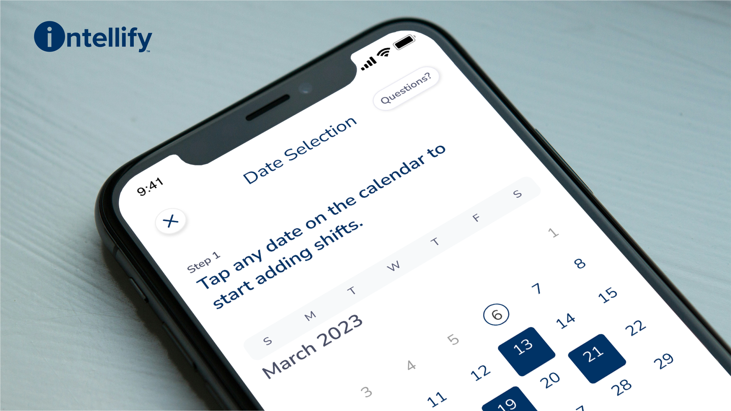
Calendar: The calendar provides the user with high level details as to booked and canceled shifts a month at a time. Additional functionality was crafted and a "day" snapshot is provided to the user. Defaulting first to the current date, and refreshing details for any subsequently selected date.
Load time - additional experience decisions were made with development in mind, loading two months of shifts prior and following a given month, where calls were only necessary to be made when scrolling beyond that period. Research suggested the average user would likely only have an additional few weeks of scheduled shifts, and rarely need to explore further than two months past. Each additional call loaded an additional 3 months at a time per call.

Shift cards needed to provide a high level of detail to the user, but with a consistent and adaptable layout that made future considerations and variations possible.
The main component features 3 main anatomical parts
1. The location
2. Status indicators
3. Time
These sections can be broken down further into the categories outlined in the example below numbered 1-5.
By placing these in adaptable containers within the component, we allow cards to be used across a number of use cases, while being malleable enough to add or omit information, and keep the same pattern enabling better pattern recognition for our users.

A simple but effective messenger that takes a page from common messaging apps.
The initial chat requirements outlined a simple chat without the ability for a user to have multiple documented conversations. Instead, the end-user would have a single continuous conversation thread with their facility. .
Due to this, the user could enter a chat request with the client/admin users responsible for scheduling. Although they would be messaging in a single thread, multiple respondents could be on the client side. Name tags were attached to each message in the exchange so that the HCP users could keep track of who they were speaking to in a given conversation.

Intellishift provides a robust, yet accessible feature set. From a highly customizable profile, to notifications settings, and facility contact details.

Additional app store content needed to be generated to properly showcase the app across the iOS store and Google play store, as well as providing additional graphics for marketing channels.
We wanted to focus on showcasing the experience agnostically, avoiding any branding given the apps white label intent, and focus on our major features and value props.
I drafted a number of layouts and value props before we settled on the following material.
Emails and Landing Pages designed within business and branding/marketing restrictions.
When designing the invitation email, special attention was paid to making the process as quick and easy as possible.
We chose to ensure the install and sign in would require one step. HCP users would have an account and credentials already generated for them - all they had to do was install the app and sign in with those credentials.
When viewing on mobile users can quickly and easily install the app via the app store CTAs. When opened on desktop, a QR code was included that allowed users to easily scan and install on their mobile device.

Allow HCP users to access and schedule their shifts with ease.
Personalized profiles so users only see the shifts that are applicable to them.
Stable and well designed for minimal friction, confusion, and cancelations.
Keep users updated at all times push notifications to stay updated at all times.
Documentation and transparency across scheduled and past shifts.
Allow HCP and Scheduler parties to connect and engage in necessary communications.
Spending more time in planning to plot out future edge cases.
Thinking more holistically about our product ecosystem, and which products would benefit from continuity (e.g. upcoming Intellishift mobile).
Ensuring more consistent and attentive communication between design and development channels.