2024
Cross Country Healthcare
Mobile and tablet product design
Sr. Product Designer
Intellify Mobile is a companion mobile app aimed at providing healthcare facilities and client users with an on-the-go staffing solution. With robust scheduling and shift creation features, data visualization, and productivity enhancing tools, Intellify mobile facilitates booking, monitoring, and managing personnel and facility needs all on a users mobile device.
I owned and led design across mobile and tablet — playing a critical role in scoping and prototyping a vital feature set, while modernizing the product alongside updated color guidelines and a mandate to establish a new but related mobile design system. Intellify Mobile has been highly praised by key stakeholders and is currently in the process of launching.
Client users needed a way to manage their staffing on-the-go, from unit to unit, and across facilities. The obstacle of finding a desktop, logging in, and managing professionals given the nature of working in a busy healthcare environment was a major pain point - hindering productivity, communication, and schedule fills.
A nimble and highly functional mobile and tablet companion app that allowed Client users to support hundreds of healthcare facilities and tens of thousands of HCPs. By expanding on the core Client user features of the Intellify Saas product, we established much needed process improvements, accessibility standards, and simple mobile data visualization tools; allowing users to work more effectively on the floor, increasing productivity, and reducing miscommunications, shift no-shows, and shift cancelations.
1 Designer
1 BA
2 Product Owners
1 Lead Developer
1 Business/Operations rep
6 Months
- Led concept to launch design process as the sole designer and owner.
- Collaborated in requirements planning.
- Mapped and planned app structure, produced low-fidelity wireframes, high-fidelity designs, and fully clickable prototype.
- Produced user flow demos for sales team.
- Established mobile design system.
Product Design, UX/UI Design, UX Research
Due to the success of the desktop Intellify solution, the product owners already had enough signal from clients that a mobile counterpart was both necessary and a major market opportunity.
We as the product team were tasked with figuring out to what extent.
What products exist to schedule and manage HCP pools on-the-go.
How do we repackage existing desktop features for a mobile app experience, and what pain points may result.
What are users current pain points and how do we establish an initial set of MVP requirements to address them.
Which existing or potentially new features are essential to facilitate and improve the process?
We already had an established user persona from our experience with existing Intellify clients. We knew our users pain points and we knew they were being held back.
It was critical to understand the intricacies in the healthcare staffing system. Moreover, understanding our own development limitations and what would be possible in the MVP development cycle - specifically, what do we need and what can we achieve in the MVP, and what can be scaled on later.
Mapping was established to define the general structure of the app. We defined the MVP essentials and got to work.
The sheer volume of copy, details, and industry specifics meant we needed to design with real world info early on. Mapping and medium fidelity designs were completed to define a starting point and work through some initial requirements with the BA and Product Owner.
I started by asking a lot of questions about the current product.
How do client users currently work with Intellify?
What screens do they visit the most?
What features are most essential for their day-to-day?
Concepts were iterated on, through copy adjustments and by way of visual solutions: using color, interactions, design patterns like progress bars, and intuitive icons and indicators to balance the data and text heavy requirements we knew we couldn't leave out.
Using components from the Intellishift mobile app, I was able to quickly work and justify starting at a medium fidelity state. Feedback and insights gained from prior research and analysis, and early planning session allowed rough outlines of patterns and styles to be drafted with confidence, and for input to be gathered and acted on efficiently.

Challenges:
- Mobile limitations tracking fill rates while accessing pools & applicable HCPs.
- Inability to perform multiple tasks at once.
- Analytics and data visualization that facilitated the mobile experience.
- Lengthy forms and compliance requirements to create shifts and assign professionals, cumbersome healthcare specific information.
- Navigating strict industry requirements that dictate professionals eligibility and license/training compliance.
- Healthcare scheduling nuances: repeated shifts, block booking, bonus guarantees, Licenses, HCPs shift preferences, cancelations, shift requirements, and onboarding specifics.
Data visualization tools were streamlined, graphs were carefully selected and designed, heat maps were crafted, tables were converted to selection flows, screens, and lists, and omissions were made to features that wouldn't benefit a user in the mobile context.
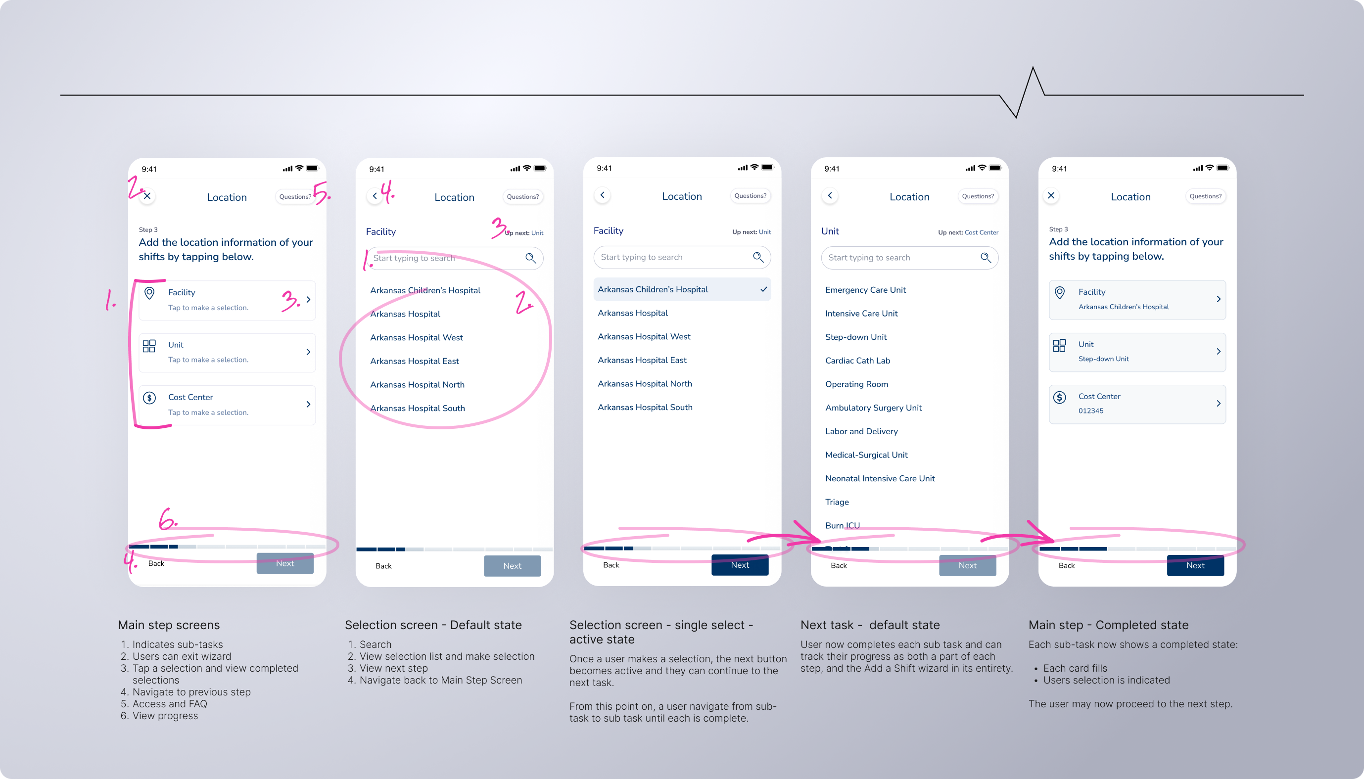
A concerted effort was made to keep the user from having too many options at once. Instead each major feature is designed to work through extended flows or wizards, isolating steps logically and walking the user through each phase. Whether they're signing in, creating a shift, booking a professional, or working to customize a professionals schedule, lengthy forms and frustrating dead ends were avoided.
The sign in flow was straightforward enough. We also pushed for biometric sign in to cater to all users and their preferred methods of managing credentials.
Also shown: Password Recovery, New Password
For security reasons users are logged out after inactive periods of time. Depending on the users preference and to alleviate friction and speed up log in, a biometric log in was accomidated for.
The add a shift flow was extensive and detailed. Each step was dependent on the previous so the decision was made to build a wizard rather than a lengthy form that could increase cognitive load and user frustrations.
Additionally for MVP, users didnt have the luxury of saving a partially finished shift creation - for that reason I wanted to make the process simple, step based, and borderline gamified to avoid fatigue.

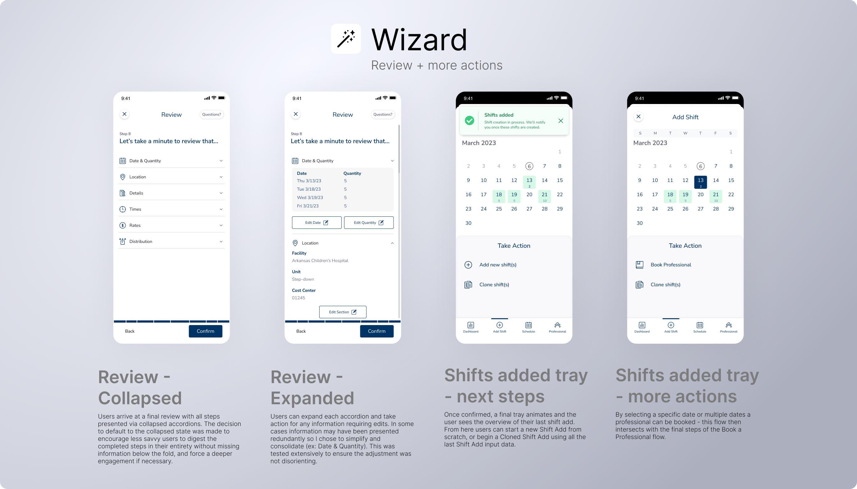

Intellify Mobile enables client users to do more - anywhere, anytime. The designs below made the often complicated healthcare staffing and management process an easy to use, user-centric mobile app. By employing wizards, simplified flows, smart hierarchically aware content and information design, and employing the law of common region and common-sense mobile best practices - the process of quickly creating shifts, assigning professionals, editing, and managing fill rates that users depended on with the Intellify Saas Solution, was now possible on their mobile device.
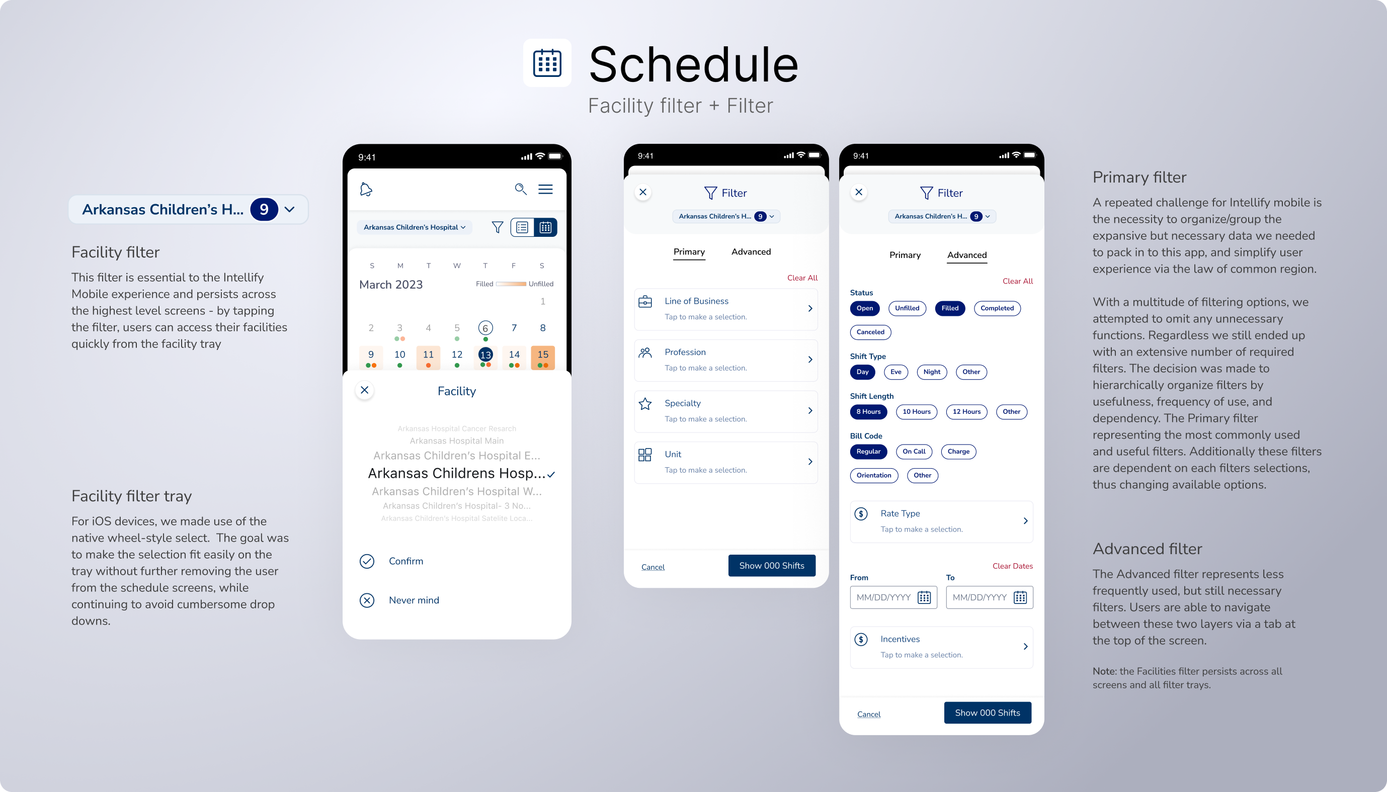
Challenge
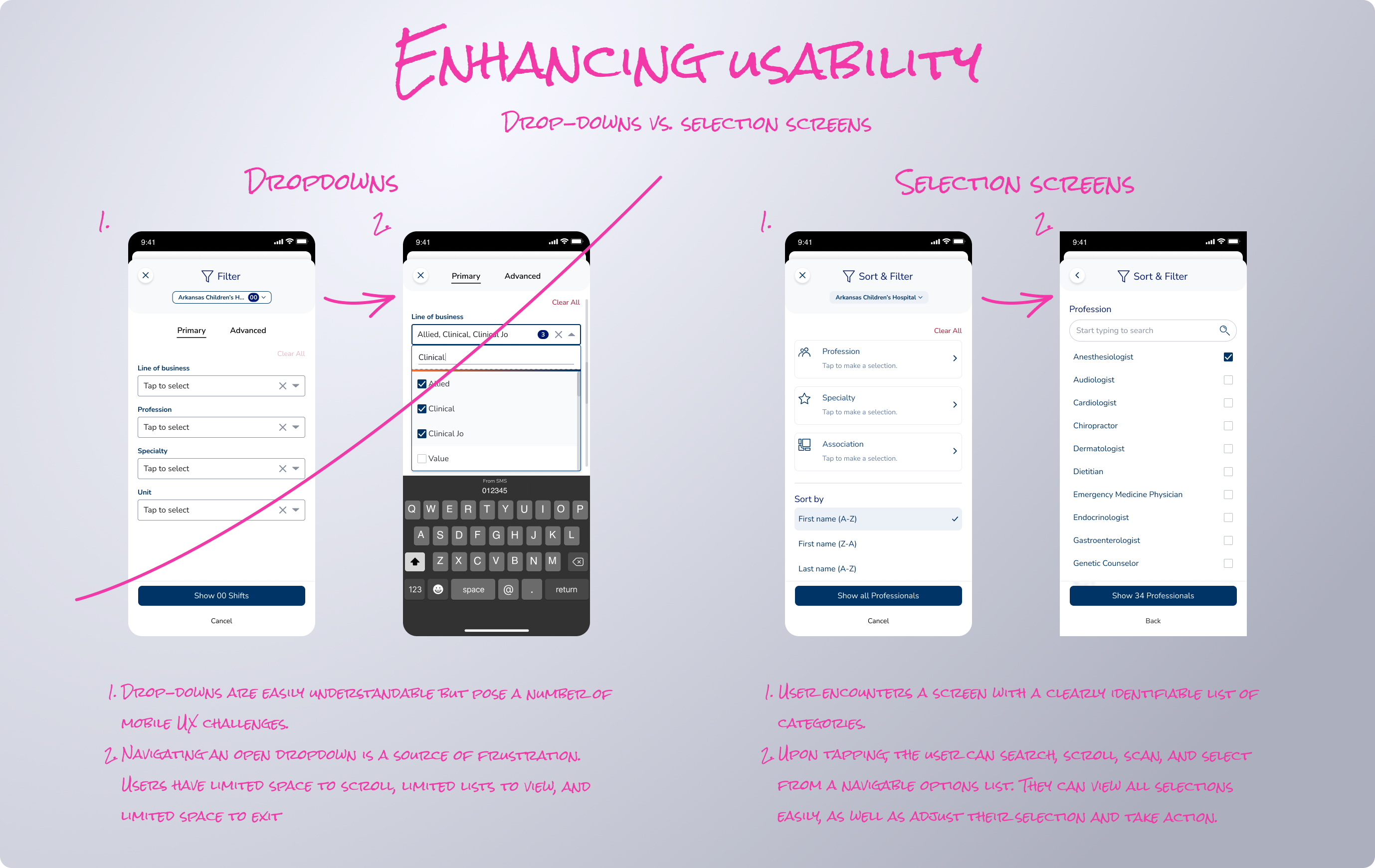
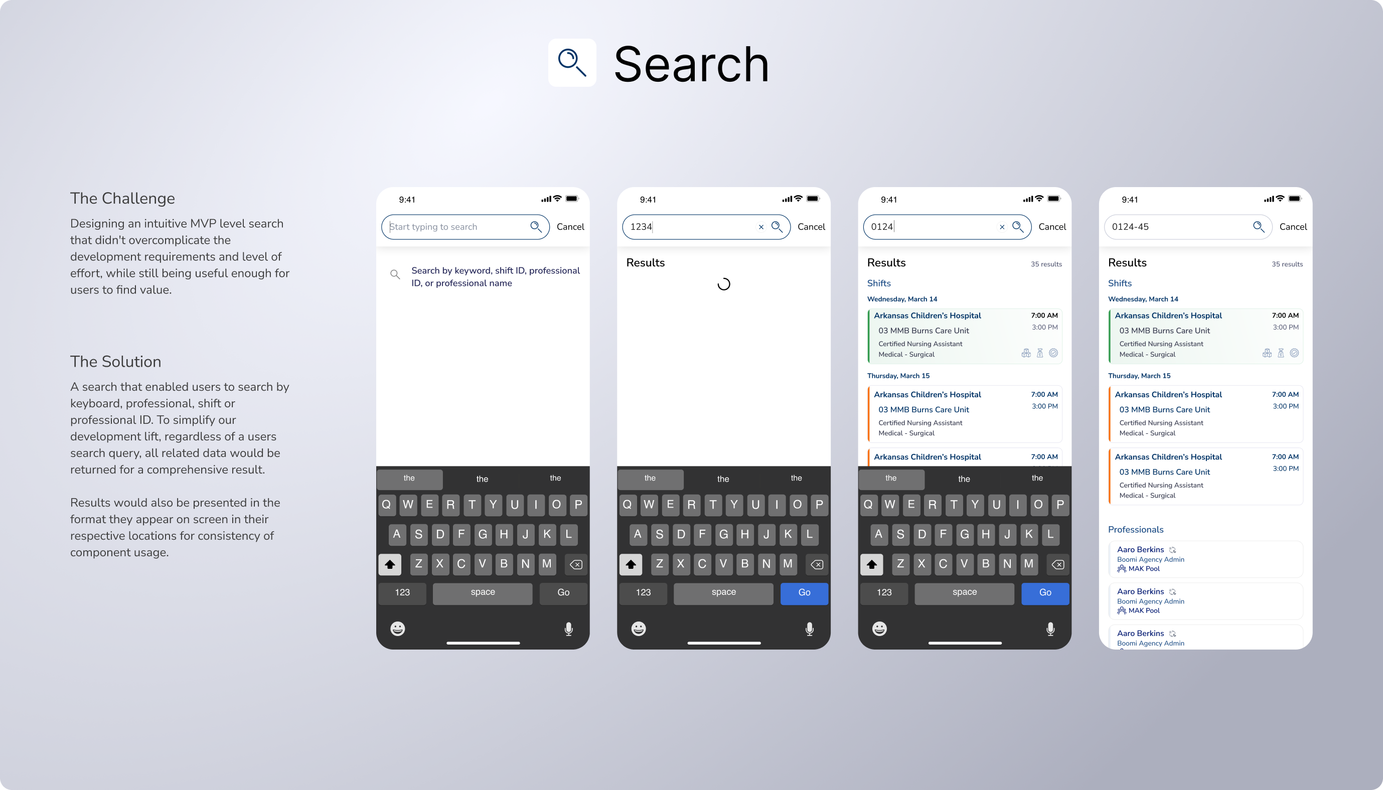
Testing showed us that drop downs were a headache for mobile users. They're limiting, frustrating, hinder navigation and a users ability to navigate both the dropdown and the page itself. Moreover our drop downs included expansive lists of options and required search features which compounded that friction (especially on smaller Android devices).
We saw a clear correlation between the stress and frustration of poor navigation - and user error.
Solution
By isolating actions to dedicated lists users are able to search and interact with their options in a less overwhelming context. The stress and frustration of poor navigation made the decision making process clearer, reduced the cognitive load, and learning curve burden to master an inefficient process.
Learn more below:
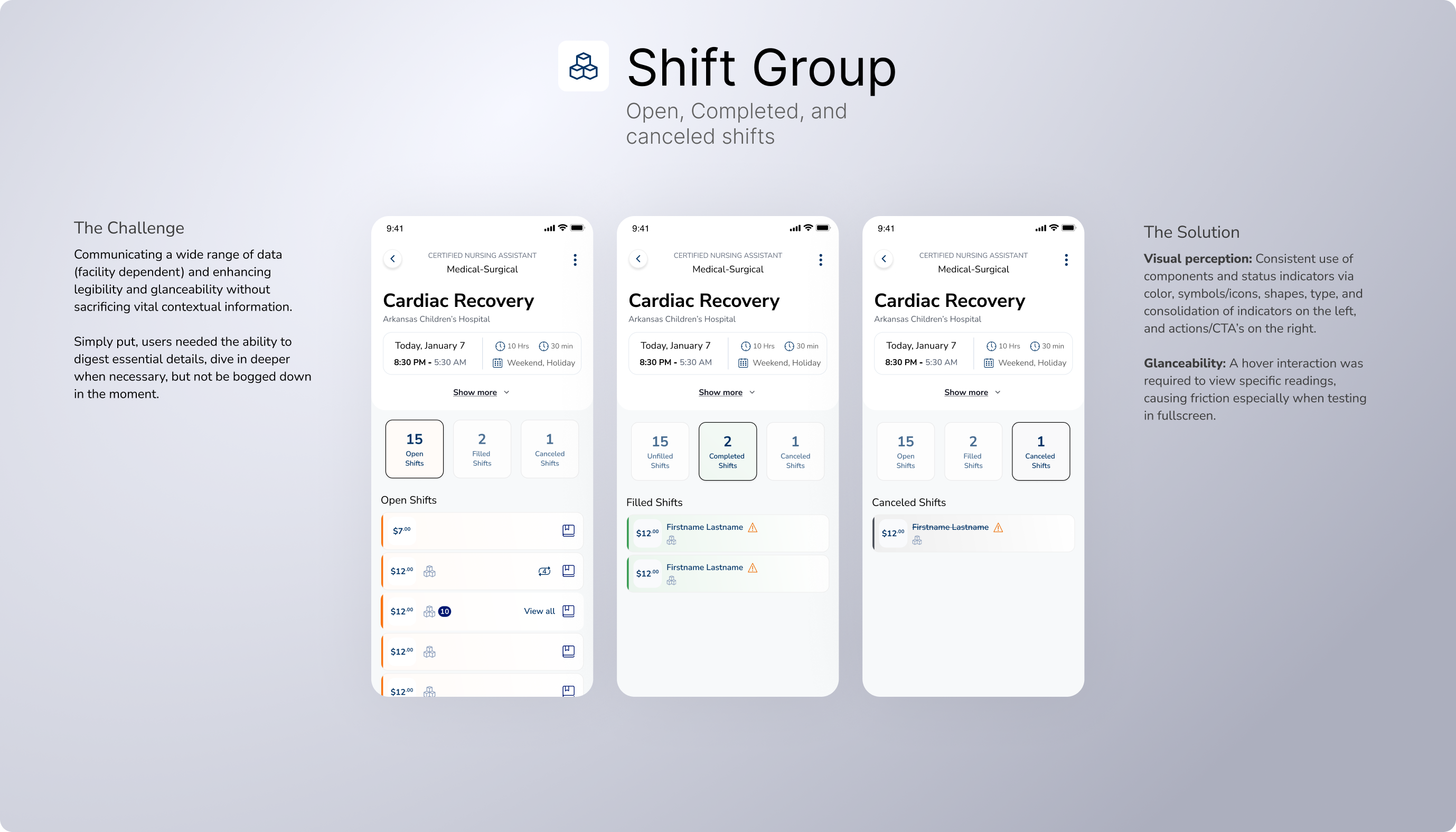
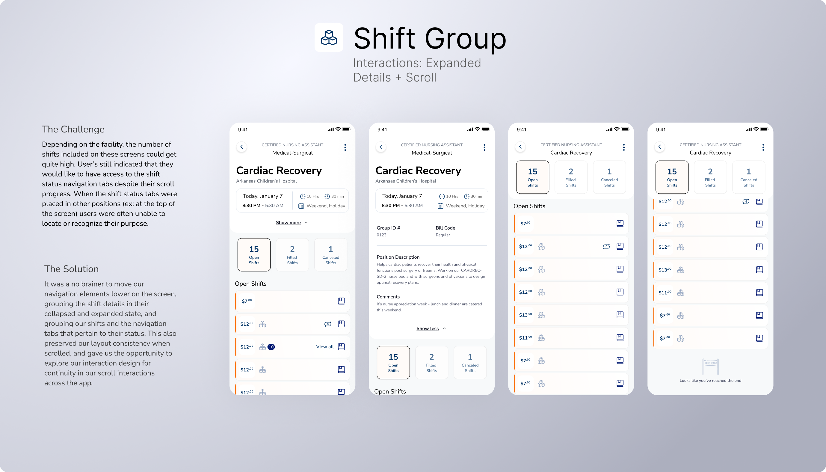
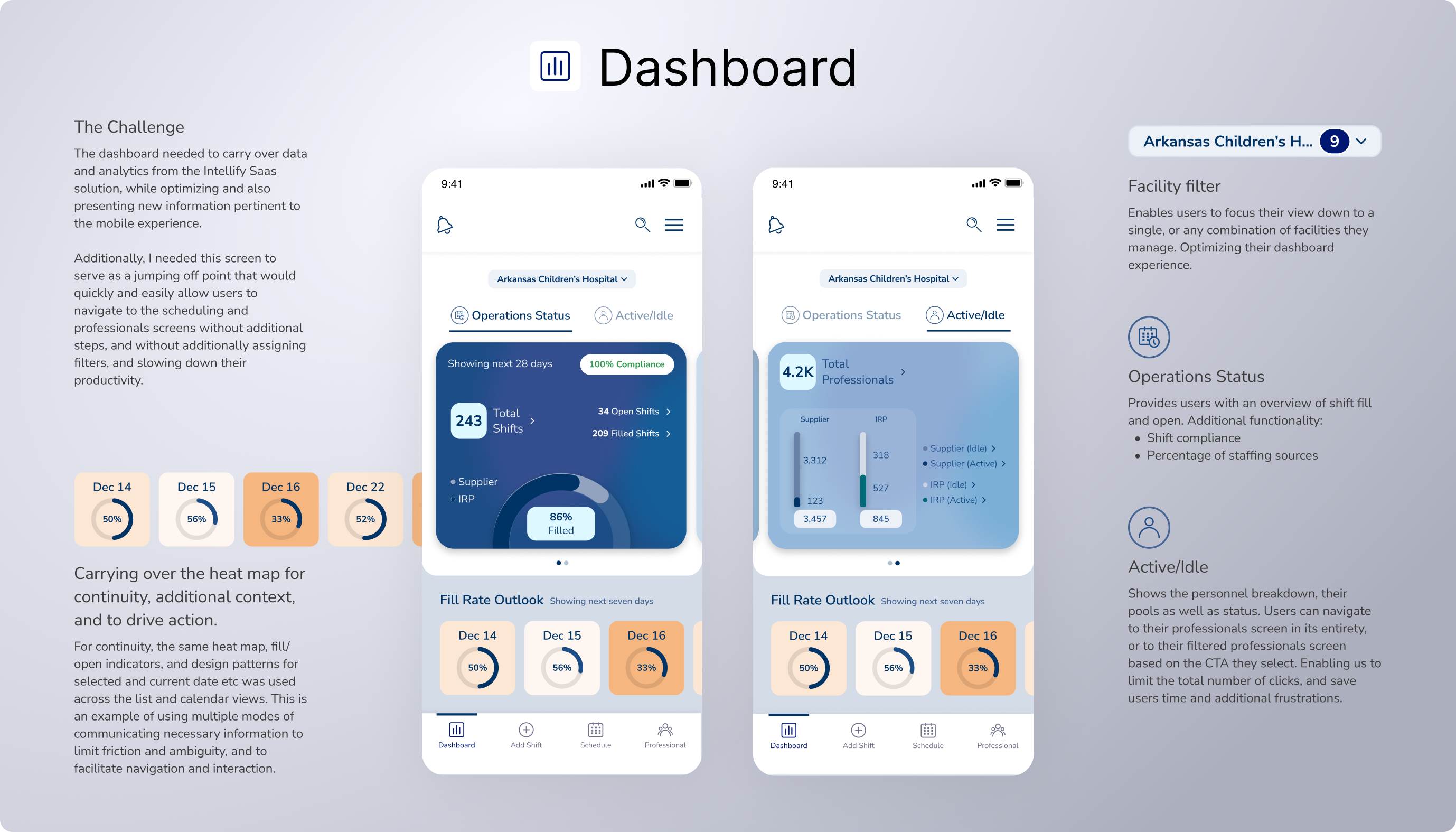
One of Intellify mobile's defining features was its ability to show users different types of data (visual, textual logs, and graphs). To make the data easier and faster to interpret, my approach was to treat each data type as its own distinct module — following the law of common region.
My design direction focused on enhancing legibility and glanceability through the addition of valuable elements like, iconography, color, and status indicators. This was achieved successfully by using patterns similar to the desktop product, and grouping information into easily understandable common features. Using a calendar as a heat map allowed us to use a familiar medium to deliver multiple levels of data: open shifts groups, filled shifts groups, as well as communicate the total fill.
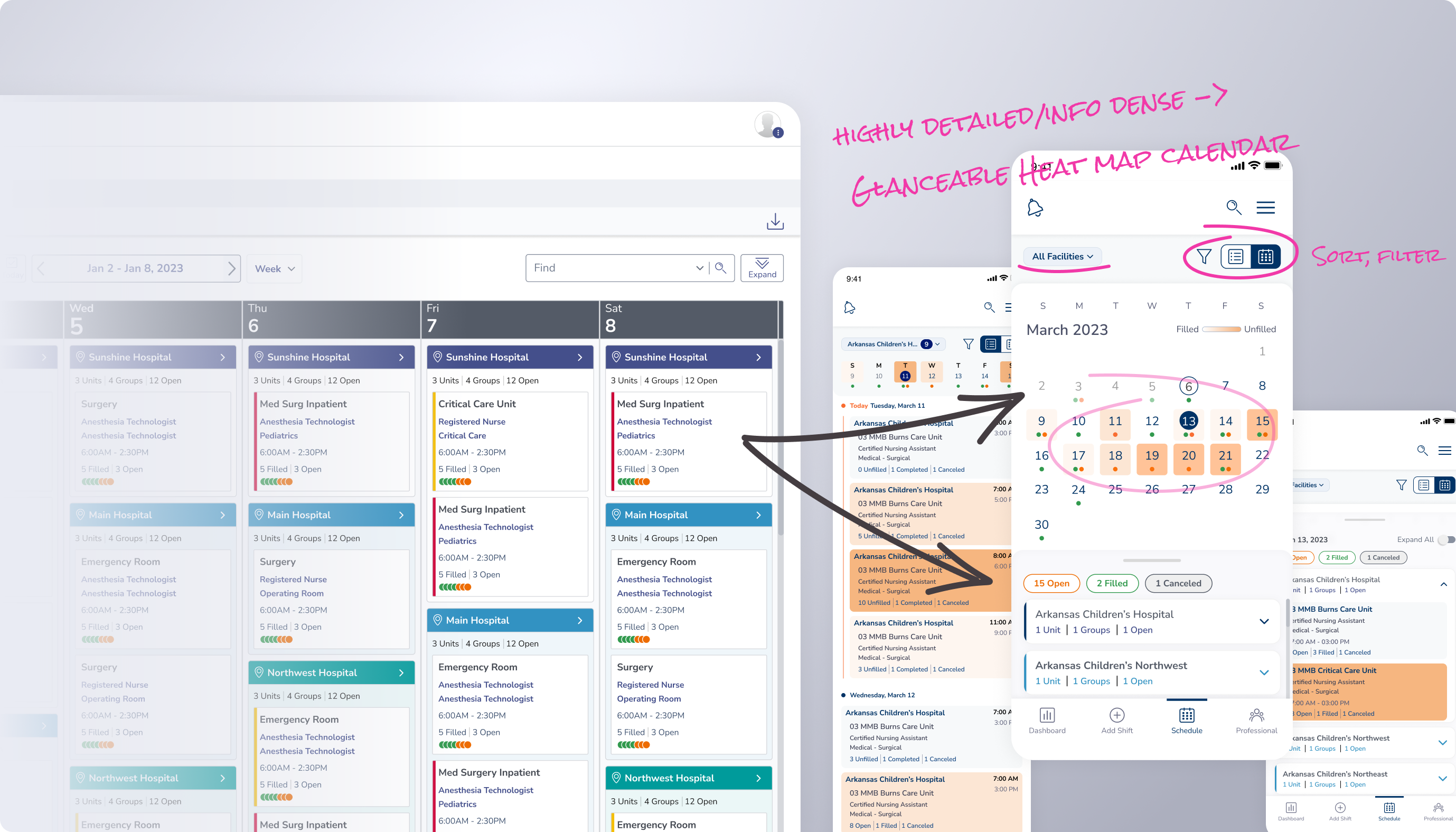
The primary schedule screen features a toggle between two views: Calendar, and List - allowing users the flexibility to view a facility or a units fill rate in whatever level of detail they prefer.
The calendar view provides a scannable and actionable view where as the list view provided users with more detail for specific shifts. Enabling users to engage how they deem most useful.
The introduction of a toggle switch would enable users to choose which mode was preferred, while the additional utilization of the heat map filter switch would allow users to fine-tune the complexity of the schedule through a one-time interaction.
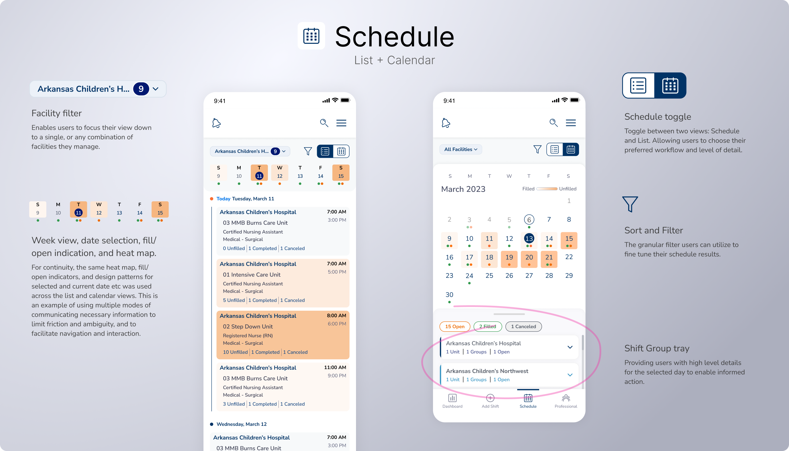

The screens could've easily become overwhelming to the user. Instead we continued the goal of minimizing information, and maximizing the scalability of each screen. Shift types were grouped and isolated by tabs, color, and status to further organize content. And layouts we're designed to be modular and accommodate the wide range of use cases and needs each healthcare facility may face.
The final step of each major flow. Professionals were organized by pool and compliance, search, sort, and filter was introduced to make navigating pools of hundreds and potentially thousands of professionals simpler and more manageable. Compliance warnings and additional confirmations and contextual information was designed to ensure no mis-scheduling or misunderstandings would result this late in the flow.
Reshaping data tables for a better mobile experience
One of the major challenges in translating the Intellify Desktop solution to a mobile format was navigating the imense data present in the various data tables that Intellify's user experience is built around.

The dashboard needed to provide high level details to help users take informed action. I also didn't want users to get caught up in the minutia and detail from the desktop solution.
To streamline, I adopted some simple data-visualization tools from the Desktop solution, and introduced a new fill rate outlook feed just for mobile users. This helped to prioritize and execute where attention was needed in absence of a users ability to reference multiple screens at once, and access data tables and sets.
Each professional has a dedicated profile with their schedule, additional schedule and shift match options, and an about page with their compliance, association, preferences, and contact information.
Similar patters from the list view calendar screens were adopted here for consistency, as well as swipe interactions to enable booking and additional actions more efficiently.
Additional visual cues were designed to indicate scheduled days, as well as shifts suggestions with match the individual professionals preferences, thus making scheduling an easier, more intuitive, and smarter task, while mitigating cancelations, and other scheduling complications.

An advanced search allows users to quickly find professionals, associated shifts, open shifts, and more.
I presented each option as it would be viewed in the add shift, book a professional, and calendar views for continuity. The goal across this app was to use a common and intuitive design language that helped users to always feel confident in the information being communicated.
Seamlessly introduced an improved mobile counterpart to the Intellify Saas product.
Reduced cognitive load by making information heavy processes into digestible steps.
Enabled staff management and shift fill on the go, anywhere, anytime.
Meet the business goals and expectations of our clients in a mobile format.
Reduced friction and established superior UX impacting our range of mobile products.
Define a design system specifically for mobile applications within our Intellify product ecosystem with 90% adoption.
In the pursuit of optimizing the experience for mobile while avoiding deviating too far from the existing Intellify product, a mobile design system was adapted from the original Intellify Desktop Design System. Color and typography would be adopted 1:1 and used to create continuity across products.